Tool tip in Axis bank fund transfer form
If you're web developer, every form you see across the Internet is an opportunity for you to learn about presenting options to the user. This is my observation of Axis bank fund transfer form.
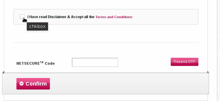
Inappropriate use of tool tip Tooltip should be informative and the Control displaying that should benefit from the supplementary information. Displaying "chkbox" doesn't add any useful information to the user. Also, "chkbox" might actually be confusing to a non technical user.
Buttons I personally think "Transfer" or "Pay" could be more appropriate caption for the button instead of "Confirm". I'm not confirming anything in this screen. The bank can show "Resend OTP", only if it is more than a minute since the form load and it isn't submitted yet.
For my new posts, subscribe.