Contextual Communication
While I was reading about the recent security breach that happened at zomato last week, I noticed a few things in the blog hosting platforms.
Sites
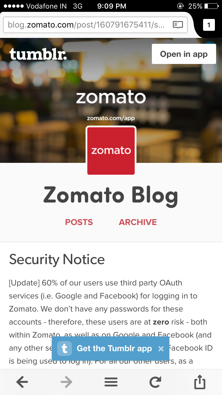
- Tumblr - http://blog.zomato.com/
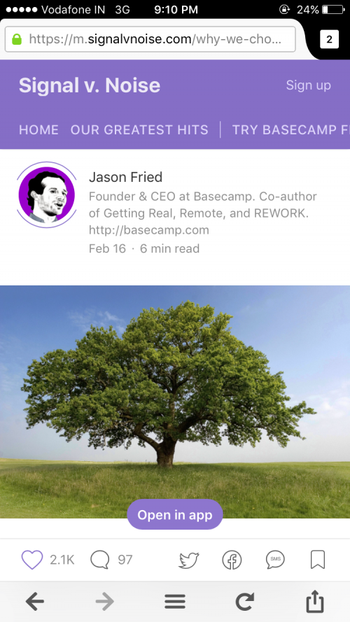
- Medium - http://m.signalvnoise.com/
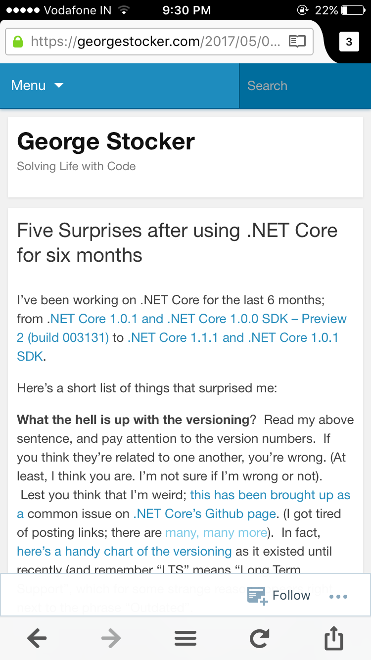
- WordPress - http://georgestocker.com/
1. Install apps/Open in apps
Only WordPress presented me the page without any such messages. Both Medium and Tumblr were showing me "open in app".
A user to this page can be of two types
- An unregistered casual user
- A logged in user
If you ask me, these platforms shouldn't show generic messages like "install app" or "open app" message in the first place. Instead, they should show it based only on the logged in state of the user.
For a logged in user, only when he clicks on the "write" button or types in a comment, these platforms should display "install app" notification. Since he has an account, he might consider installing the app. And also, you are talking to the user right in the context when he is about to do it. Such contextual message might work better since the native app is perceived to give a rich writing experience.
But when I am reading an article which I landed via search, your "install app" call to action seems too much to ask for. When a plain web page could suffice my need, there is no motivation for me to install your app.
Also, Tumblr's "get the tumblr app" and "open in app" seems contracting to me. It can be either one, not both.
2. Avoid the platform that has a different motivation than yours.
Tumblr is more concerned about letting the user know that he is reading it on Tumblr. You could see tumblr twice on the page. Medium is known for its clutter free, eye pleasing typography. In WordPress too, the focus is on the content but without much style. The focus was more on Tumblr than Zomato. The Focus should be more on the content than the platform.
3. Contextual widgets - Using the screen real estate better.
Though, WordPress fared well in #1, #2. It failed in this. Medium to an extend does this better. You could see the social sharing options at the bottom of the screen. It will be visible until you reach the response section of the post. Another example I can think of is TOI. TOI takes it to the next level by adding whats app to the share widget.
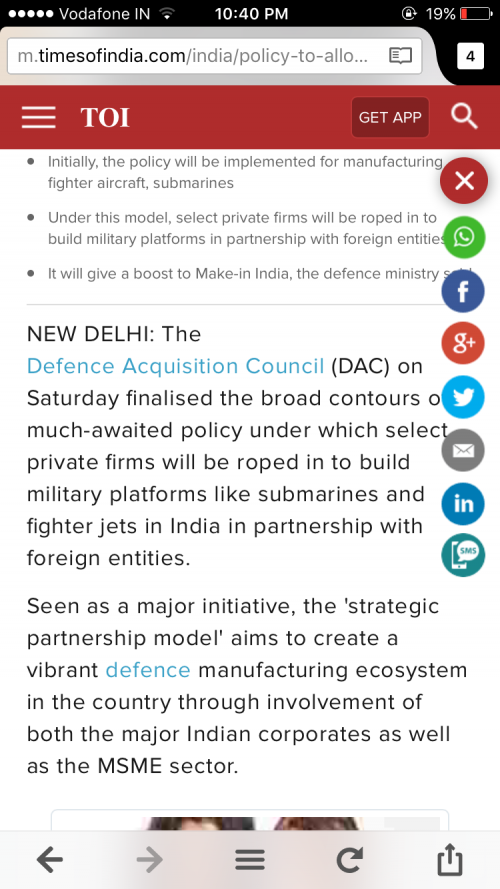
Use case of the user and the knowledge of the access device plays a huge role in delivering a good user experience. Showing whats app, share via SMS in the share widget is more contextual than showing generic "install our app" notification. Use the access device's capabilities to the fullest to deliver the contextual communication.
For my new posts, subscribe.